
I have built a pretty powerful tool that reveals trades and I wanted to share it with you to show how it is interpreting the Fed’s impact on the markets. The indicators on the chart are pretty simple. Sell the red/ buy the blue below. The indicator is inversely related to the price of SPX.
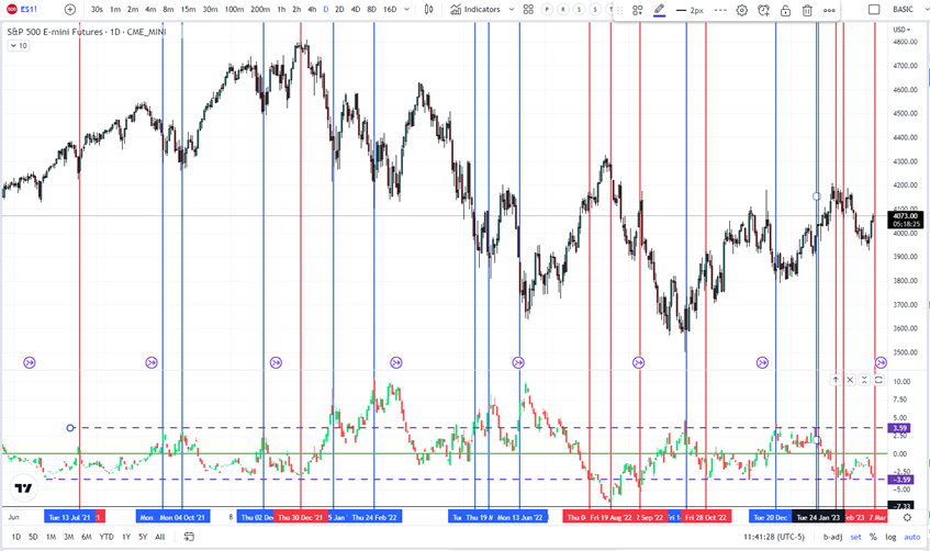

I have included some history in the chart to show how effective it is. Didn’t expect Powell to be dovish yesterday, given other Fed speakers over the last few days have clearly stated Feds intentions.
Looking for another revisit to SPX 3900 so it is a time to sell.
Thanks,
Joe
PS–Just a reminder, I am keeping these notes to you short and sweet and my hope is to point you in the direction of great trades. I hope you enjoy them and hope they are helpful.


Recent Comments