
How do you find these set ups? It is a question I am asked very often and I wanted to share one of the tools I use to lock in on moves with big potential profit.
The Bollinger Band indicator combines price and volatility in a formula used to display a graphical “band” or area between two moving averages on a price chart to show when an asset is potentially overbought or oversold. In these scenarios, the Bollinger Bands can indicate the momentum of the price and provide a signal to buy or sell.
In the examples we use in this book, Bollinger Bands are illustrated by two lines with a dashed line halfway between them. The general rule for interpreting them is that farther a price is above the dashed line, the more overbought it is. The farther a price is below the dashed line, the more oversold. The farther the price moves from the dashed line is an indication of how likely a price reversal is. When it gets above the top band or below the lower band it is considered
extremely overbought or oversold and is highly likely to reverse.
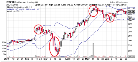
You can see above how Bollinger Bands are represented on a chart. The circled points are examples of the bands showing potential reversals. In this case, the lower reversal in mid-March alerted to a move that doubled the price.

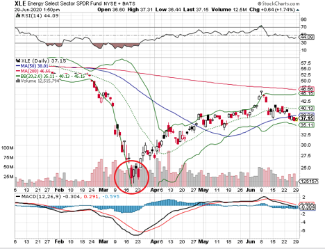
To see another example of how Bollinger Bands can show us when a stock is about to take off, look at the chart below. You will see red circle shows the stock move off the lower band and start to make its move.
These examples are from set ups I have spotted in the past, but they clearly show how effective Bollinger Bands can be used to spot winners. Add them to your charts for a while and see if it is an indicator that fits your trading approach.
Sincerely,
Ian Cooper


Recent Comments